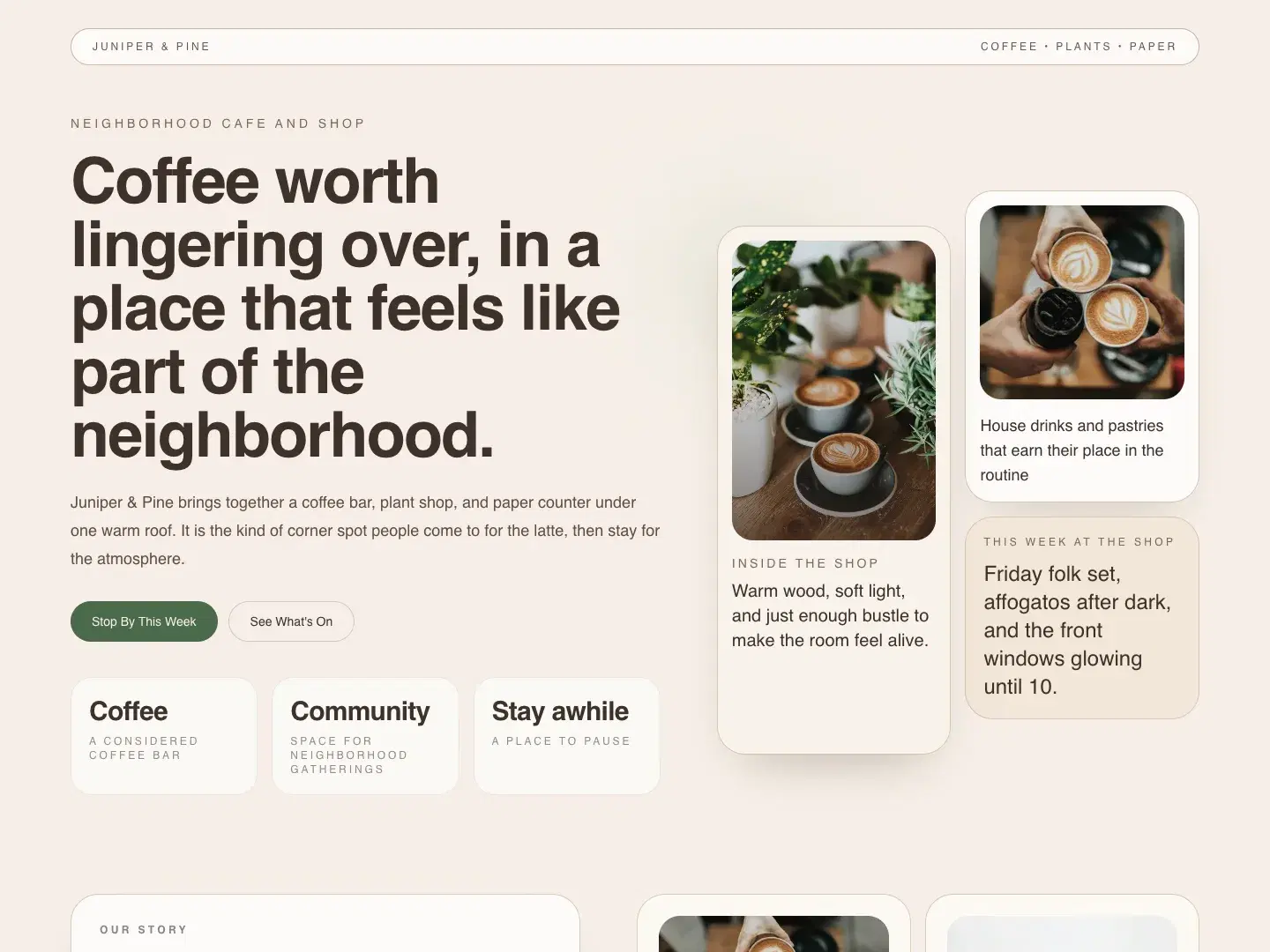
The first impression
An atmospheric hero introduces the cafe, with direct paths to the menu and upcoming events.
Self-initiated concept · AI-assisted exploration
A warmer digital front door for coffee, conversation, and live events.
← All work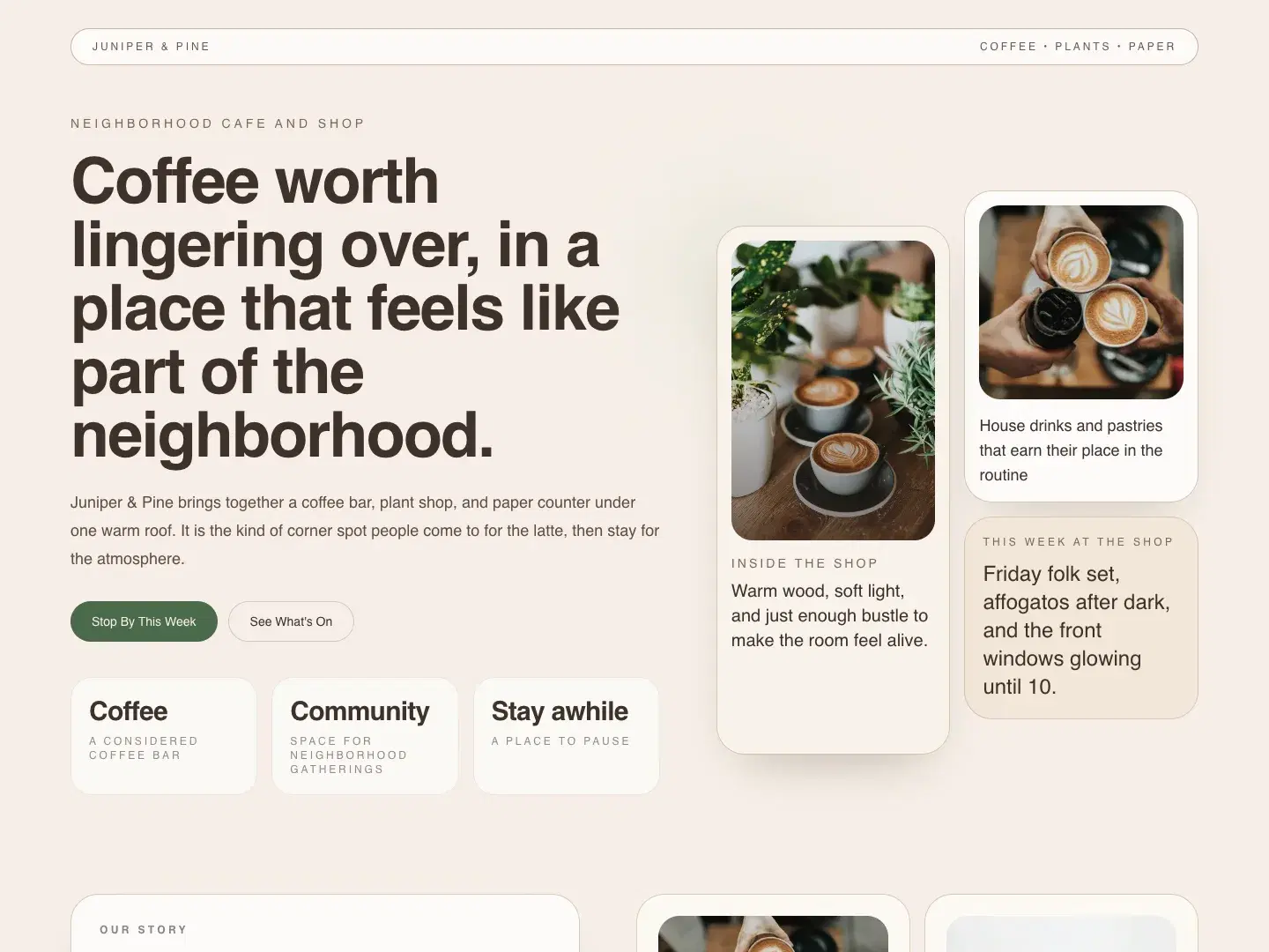
The concept brief asks how a neighborhood cafe could make its atmosphere, events, and visiting information immediately legible online.
Warm photography and a relaxed editorial rhythm make the space feel approachable. A clear visit path gives practical information the same care as the first impression.
The intended journey moves from a clear first impression to useful detail, then an obvious next action.
Cream surfaces, deep green accents, generous serif headings, and rounded image panels connect the coffee bar, shop, and event programme.
The system is intended to reflow into a readable single column on small screens. Content hierarchy, image proportions, and clear action labels carry the direction across sizes.
Visual direction / material study
Hierarchy · Contrast · Rhythm
Warm cream
Coffee ink
Quiet green
Inside the concept
An atmospheric hero introduces the cafe, with direct paths to the menu and upcoming events.
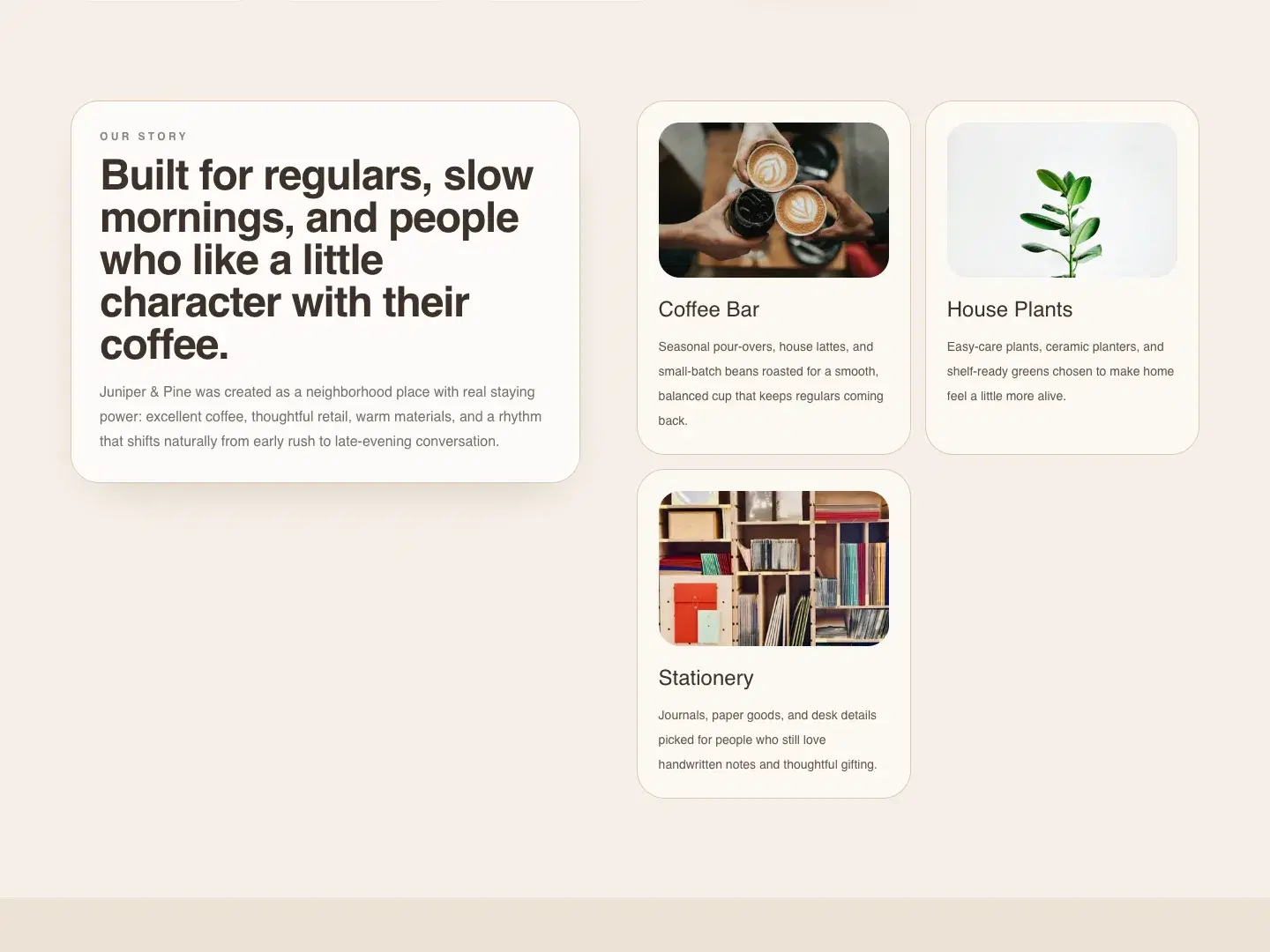
Distinct category cards give coffee, plants, and stationery their own place without competing with the visit path.
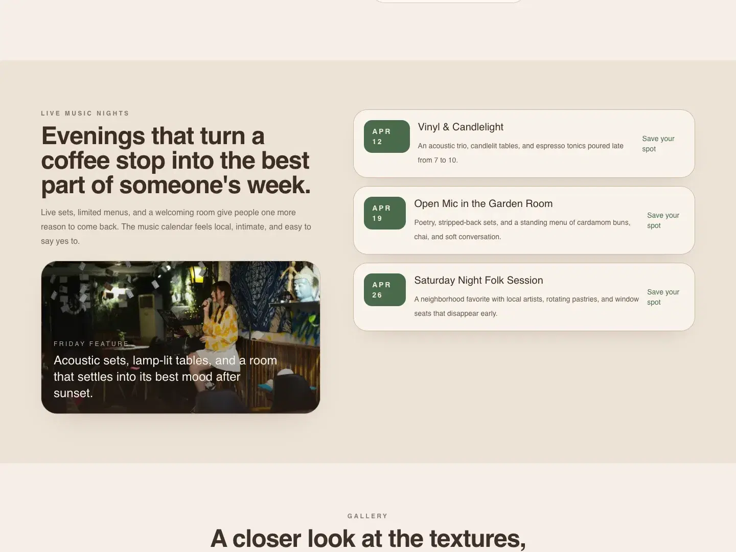
An event list and visit section bring the page back to useful information. On mobile, these become a single reading column.
This concept demonstrates a connected approach to page hierarchy, visual direction, and responsive implementation.
A real engagement would need verified content, audience research, usability checks, and validation of the business’s operating requirements. Demo names, events, products, and project details are illustrative.
Have a project in mind?